While heat mapping has been around for decades, it’s only been in recent years that it’s become more available for mainstream business use – opening up a whole new world to brands that wish to see exactly which parts of their websites and advertisements are most attractive to their intended audience.
Interested in learning about heat mapping and how to use it? Here’s everything you need to know.
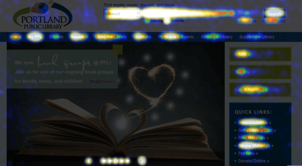
What is a heat map?
A heat map is a tool that allows webmasters to visualize the behavior of visitors and how they interact with pages on a website. Check out the heat map(above) of the home page of our client, Portland Public Library.
Hotter colors on the map such as red, orange, and yellow are used to indicate those elements of the site that receive more clicks from viewers. Cooler colors such as blue or purple show which parts of the site are not getting as much attention.
Heat maps can be used to discover a range of possibilities from best area for element placement to whether or not your current site is confusing for your visitors.
The benefits of heat mapping
Knowing where your audience is clicking provides a multitude of insights and advantages.
Here are three of the most commonly recognized benefits of heat mapping and how the data can be used in real life applications:
Smarter site design
By knowing which elements are most attractive to your visitors and where they are most likely to be seen, you can design your site for optimized interaction.
For example, if the top left corner of your home page is the hottest part of the page and you know that your visitors love video, then placing a video message in the top left may be the best spot for your next CTA.
Improved customer experiences
By discovering the common paths used, where visitors click, and how quickly they click from one area to the next, you can determine if your site is confusing or easy to navigate and adjust accordingly.
For example, you can learn whether or not your visitors are able to quickly find the products they want by examining click patterns, time between clicks, and at what point carts are abandoned.
Knowing that can help you decrease abandonment, improve customer experiences, and drive repeat business.
Improved overall site metrics
Once you collect data about design elements, site navigation, and content, it’s easier to start identifying which parts of the site need to be tweaked to make it stickier and more engaging.
For example, suppose your current site places your checkout button on your home page below a lengthy body of text. However, after heat mapping, you’ve identified the top right of your home page as the area where visitors typically look to when they want to check out, and also know that your visitors rarely read any of the text on the home page.
You can infer that by moving the button to the upper right and eliminating the large amount of text visitors need to get through in order to checkout, you’ll see an improvement in bounces, usability, and cart abandonment.
Heat Map Studies Provide Insights
Heat mapping has also been used in a variety of studies that provide us with general web design guidelines.
Check it out:
Look left
English-speaking viewers read from left to right, so it makes sense that site visitors often look left first, and many heat mapping studies have confirmed it.
For example, this one by the Nielsen Norman Group shows that web users spent 69% of viewing time focused on the left hand side.
With information like this, you might consider putting CTA’s on the left side of your site, or choose the left side for offline advertisements if possible.
Follow the “F”
Another study by the Nielsen Norman Group demonstrated that web users have a tendency to skim text on websites in an “F” shape.
According to the study: users first read in a horizontal movement, usually across the across the upper part of the content area. This initial element forms the F’s top bar.
Next, users move down the page a bit and then read across in a second horizontal movement that typically covers a shorter area than the previous movement. This additional element forms the F’s lower bar.
Finally, users scan the content’s left side in a vertical movement that forms the F’s stem.
To take advantage of this study, be sure your important headlines run horizontal, like the top part of an “F,” and are supported with subheadings and bullet points as you move down.
Use the power of gaze
If you use graphics or photos of people on your site, be sure to note where they are looking.
According to this study, where people in images are looking will impact where your visitors look. As noted in the study, if a model looks directly out from the screen, visitors will likely focus on his or her face, but if the model looks at the product or offer you’re advertising, users are programmed to follow that gaze and focus on what the model is focused on.
And it’s not just models: arrow-like shapes/graphics can have the same affect.
Heat Map Go To
Generalities are great, but it’s important to remember that every business is different.
It’s always best to track your own data when possible. If you’re ready to get started with your own heat mapping tests, here is a list of paid and free mouse-tracking solutions, which are typically more widespread, easier to use, and more affordable than eye-tracking solutions, for you to consider:
Crazyegg: Pricing begins at $9/month with free trials available.
Mouseflow: Try the “forever free” basic plan or others beginning at $10/month. Mouseflow also offers a different solution for e-commerce tracking.
Clicktale: This is a more complex solution favored by enterprise-level brands. The subscription is free up to 400 page views/month. Contact the company to get a quote for more page views.
Heat Maps by SumoMe: A completely free option and WordPress plugin.
The Bottom Line
Heat maps provide a lens into the minds of your users. Use them for insight into how your audience behaves and interacts with your website. Just remember that it’s always important to benchmark, test, and tweak your strategy regularly.
About VONT Performance Digital Marketing
At VONT we believe that change is the only constant in the digital world – and that excites us. When tools and environments are constantly changing, new opportunities to help our clients achieve success are constantly arising. Each new advertising technology, social platform, or design approach allows us to improve on the results we achieve for our clients.
We believe in this idea of continual fine-tuning so much that we named our company VONT, which means to achieve exponential improvement in incremental steps. It is our core belief, and the reason why we are not simply a web design company or simply a digital advertising agency, but rather a long-term, single source partner providing a comprehensive array of web development and digital marketing capabilities.
In short, we’re here so that our clients achieve success in the ever-changing digital world. If you’d like to learn more about VONT and the work we’ve done with our client partners, visit our Work page. Or, if you have a question, contact us. We’ll get right back to you!